7 Customer Lifecycle Campaign Examples
Customer lifecycle marketing campaigns are the most effective way to address evolving needs through the customer journey. With a segmented user base, you can effectively target groups based upon the current relationship with your brand to improve user experience, build loyalty and increase revenues.
Generating sales with new customers and securing repeat business is a matter of providing consistent value across your lifecycle channels. The challenge here is targeting the right customer lifecycle segment and sending an engaging campaign. Each campaign you run can increase activation, referral and revenue goals.
In this post, we’ll discuss how you can maximize revenue with lifecycle campaigns by using best practices provided by seven leading ecommerce brands. Our guide through the customer journey will also look at the total spectrum of lifecycle emails and how to optimize for mobile messaging as well.
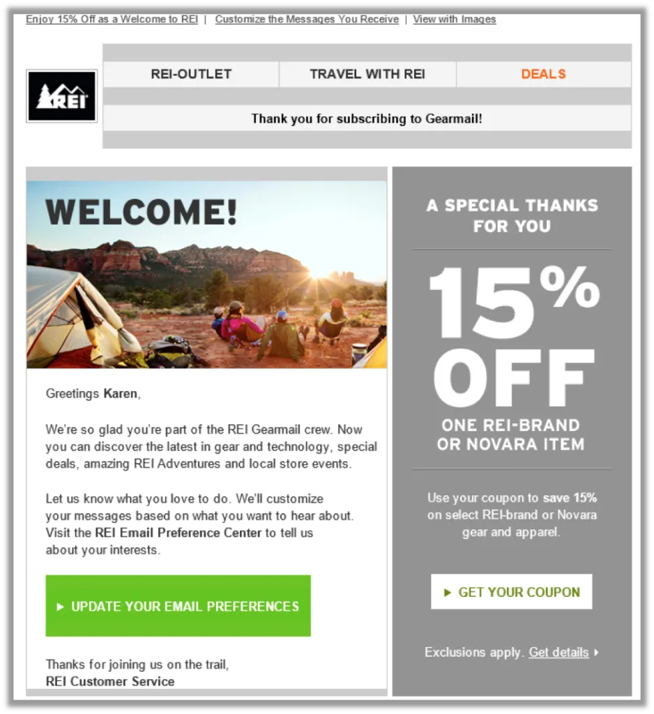
#1 REI - Welcome Email
 (Source)
This onboarding email from REI makes readers feel very welcome as part of the outdoor retailers Gearmail camp. Welcome emails need to make users feel appreciated and establish trust as well as a line of communication through newsletters. The brand takes the opportunity to welcome Karen in a very personalized fashion (kudos) and goes on to outline what’s to be expected when navigating the world with REI gear. “Let us know what you love to do” and the evocative green CTA at the page bottom entices us to further customize our interactions.
REI makes sure to add value in their onboarding correspondence in the form of a 15% discount coupon. The design layout in the email guides the eye from the central copy and over to the offer. When the reader’s eye lands last on the “Get your coupon” CTA that offsets against the colors at left, we’re more inclined to take action.
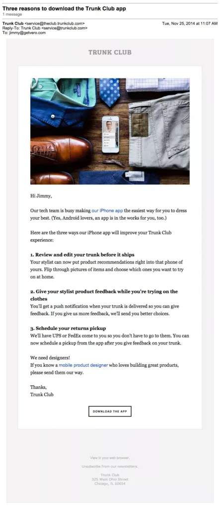
#2 Trunk Club - Nudge Email
 (Source)
Part of the lifecycle onboarding process is the nudge email, which Trunk Club executes flawlessly. A bright, bold branded image greets and reminds us of the value behind the personal shopping and shopping service. If users are to complete the desired actions here, the email needs to provide them reasons to do so.
From subject line, headlines, intro body content, this message is all about the list of three benefits app users will enjoy after download. The copy does a fine job of reiterating how easy using the app will be and providing an additional link above the CTA. Enumerating the benefits for readers in concise, user-focused language makes the copy compelling. The black and white call to action at the bottom fits nicely amongst the text, beckoning with a “Download” right now.
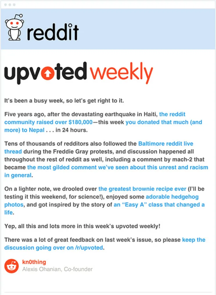
#3 Reddit - Newsletter Email
 (Source)
Newsletters are a great form of subscriber email because they include links to curated content and, therefore, supply instant value to readers. Reddit’s “Upvoted Weekly” lets readers in on the scoop that’s happened online, suggesting they come back and engage onsite after reading a playful mix of serious and lighthearted materials.
Jumping right into content, this newsletter wastes no time providing heaps of good content, but lacks a CTA or further ways to engage with the brand. Be sure to optimize your subscription emails by including conversions relevant to your brand. For Reddit, getting users back on-site at “/r/upvoted” is sufficient.
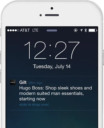
#4 Gilt - Promotional Mobile
(Source)
Luxury e-commerce retailer Gilt gets promotional with their lifecycle mobile push notifications. Sending special offers is a great function for promotional messaging (email too), but it requires a degree of care. Users who receive irrelevant or valueless messages will disable notifications - and emails can end up in the purgatory that is the “Promotional” tab in Google. Be sure to segment users when sending special offers. For example, you don’t want to offer a cut-rate price to someone who just paid full price yesterday.
The copy here is specific to stylish men, reminding users first thing that a selection of Hugo Boss goods awaits them in the app store. “Shop … starting now” runs the phrasing, effectively adding an air of urgency and direct action to the message. Gilt obviously knows their segments because this user has shown an interest in suit items and is at a stage in their buyer's journey to consider such items. An example of mobile optimized messaging, this notification exemplifies keeping it short, sweet and relevant to users.
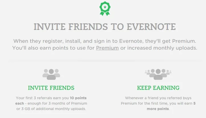
#5 Evernote - Promotional Email
 (Source)
Evernote’s promotional email is a both an upgrade offer and a referral rolled into one valuable message. By prompting users to “Invite Friends” and “Keep Earning,” the reminder app adds a personal element to the email that definitely warrants an open. By ensuring friends of referrer instant Premium service as well, the brand takes care to confirm that reciprocal rewards are mutually beneficial.
The design hierarchy is clearly organized, fastening users attention with an invitational headline and two bright green subheaders to differentiate between the two relevant aspects of the rewards package. The brand’s friendly, enthusiastic green reminds users of their brand value while standing out perfectly atop the subtle greys of the background, allowing the body copy to convert readers. Messaging focuses upon delivering “you” the reader the points you need to earn those free monthly uploads. These are some of the key elements of referral program optimization.
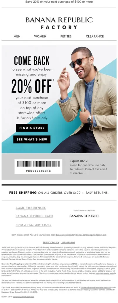
#6 Banana Republic - Mobile Re-engagement Email
 (Source)
Re-engagement emails are a crucial way of recouping customers that have fallen out of habit with your brand. Before sending tantalizing messaging to rekindle the flame, be sure to segment users for effective targeting that’s best aligned with user wants. This is the way to protect yourself from the unsubscribe bin.
Banana Republic employs a strong hero image to help dormant users imagine themselves in some new threads with this mobile optimized lifecycle email. “Come back” implores the headline copy in bold black font. Our eyes next find the centralized offer of 20% off our next order, made extra potent by the match colors between the CTA buttons at the bottom and the take-action copy above.
Also inspiring is the background layout, as diagonal stripes are a classic design technique for communication motion and activity. Color theory tells us blue is a color that communicates loyalty and serenity while white is all about honesty and purity. Match these powerhouse aspects with a well-dressed model and Banana Republic’s made a great re-engagement email.
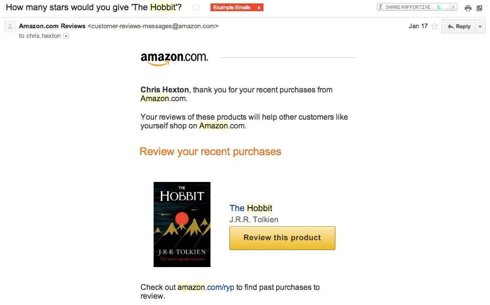
#7 Amazon - Retention Email
 (Source)
Amazon’s transactional email serves to engage customers for better retention. Asking for input on a recent purchase is smart, but since this purchase was on Kindle and the email redirected to Amazon’s main site, this is a crafty way to prompt further spending beyond ebooks. Ultimately, the message is looking for feedback and isn’t pushy about sales, which is appropriate at this phase.
The welcoming yellow CTA cries out for attention in a big way, positioned relevantly nearby the recent purchase. Chris surely appreciates seeing his name as part of the personalized message as well, helping him want to convert and rate the book. From the email subject line, “How would you….” our reader is hooked by the question and by the customer-oriented language. Amazon also includes a less-prominent link to review other past purchases as well, a smart move to engage more and earn more.
Conclusion
Lifecycle campaigns will bring customers full circle and into the next buying cycle, if done correctly. A balanced lifecycle campaign requires segmented users to target effectively because messaging must reach viewers at just the right time. Understanding customer positions within the journey allows you to deliver value to drive sales, onboard users, convert app downloads, engage users through content, prompt referrals and re-engage inactive users.
As we’ve seen, concise copy and balanced design elements are a must for driving conversions and retaining customers. Messaging should be personalized when possible, full of action words and contain clearly placed CTAs. With these elements in place, you’ll be established to routinely engage your users at any part of the funnel.